MERCH & IMAGE BREAKDOWNS


AT THE END OF EVERY SECTION is a VIDEO PLAYLIST of ALL OF THE PRODUCT BREAKDOWNS (that have videos), and also THE FULL LIST OF ALL PRODUCTS AND CATEGORIES so you can get to what you came here for easily. Each section should have a comments section if you have any comments or suggestions on that design or the products.
Designing is fun. I've always loved graphic design FOR MYSELF, because for others it gets to be a headache... just being honest. On top of that, the majority of things I've done for others, versus them actually making something good of it as was discussed when i took the jobs, is a very low percentage, so instead of "pearls before swine"ing any more, I'm investing in myself. In doing so, a lot of the wisdom and life lessons I've learned, a lot of the sarcasm i've grown into, and a lot of the beauty and pearls i would like to share, I'm learning to channel into these designs. I take it serious and put a lot into them. Also, having done a bit of production of all sorts, and been on different sides of poverty and all other lines, i know what it is to "need" (or want) something that would keep you from going over the edge, but not being able to afford it. I've seen people fall that way, so i try to keep everything affordable, even though it's print-on-demand and I'll take a bit of a hit. Everyone's going to die and leave this all here, but while here, help as many live, and spread as much life as you can-- that's why the shop (store) is how it is, and why what's in it is in it. I hope it helps you out. Just so you know, this page has a LOT of my favorites. Yeah, they're all my favorites, but this page has some top tier stuff. The DEFTRAP stuff, DON'T JESUS THE CHRIST OUT..., The Doors Are Not Exits... True, there's only a few items on each page (saves load time) but these are some good ones.
DefTrap (WWR)


AGNINADI is one of the fire dragons in the story. ABOVE are just a few of the items in the AGNINADI collection. He does not like humanity. Even more, he does not like the dragons created by humanity, and he does not like the role AI has played in their creation, manipulating mankind's hubris to create things that could destroy humanity. These "unnatural" abominations, global warming, the war, and a few other events are the things that triggered the Fire Dragons to come out of their caves. With The War raging, they took their lands (The Land of Dragons) which is just the one territory they claimed, and were driven into, seen on the map. Looking at the war torn world (or what was left of the world that Agninadi considers to belong to their race as they were there first), Agninadi rose to be the leader of the Fire Dragons, and vows to rid the earth of humanity, their digital and synthetic replacements, and any and all others who stand in his way of "purging the earth" to purify it for their race.
Blacklight Quotes; s.
THE NAME? AGNINADI basically translates into "River Of Fire" in Sanskrit. I did a lot of research on the names of a lot of the characters to make sure their names were accurate to the regions, and their nature (personalities/character). IF YOU WERE TO GOOGLE IT, you'd get something like:
THE DESIGN is easy-- it's just all of the red and black (and red & white) and sky color themed items. It started when I was making the COAL DIAMOND stuff, which is a charcoal plaid. After that, and getting down the process of making patterns, i wanted something really "fancy" and deep, something fiery, so made a paisley pattern, but in the dark coal color, which some of it was used in the COAL DIAMOND stuff, but I made it red, and then played with the red and black spaces. Yeah, photoshop again, but to get the exact patterns I actually used Chat GPT to do a small section. It was working more accurately than LEONARDO.AI which I'd paid for, and that was a lot to pay for inaccuracy. If you can do it in the perfect black and white scheme, it's nothing to invert that to get white on black, and then to colorize both to turn the white space whatever color. I was into doing the jerseys at the time, and i still love those-- but I figured to just make a collection with all of the things that had that energy to it, so anyone who is on that same vibe could easily find all of the things that resonate with them. You can check out the AGNINADI COLLECTION in the shop (store) here. There may be a few of the items in the video playlist below.
This section written 02.28.26- last edited 02.28.26
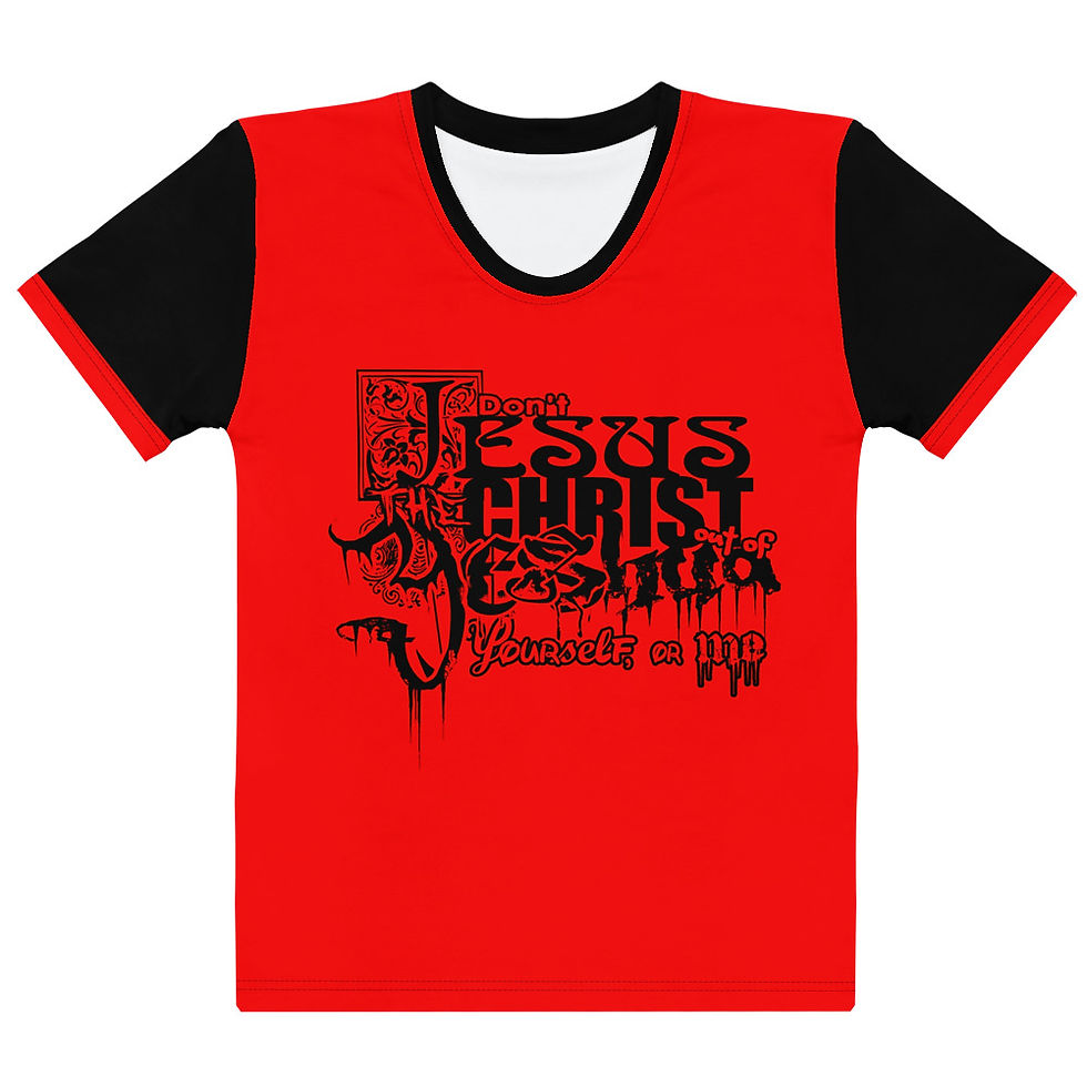
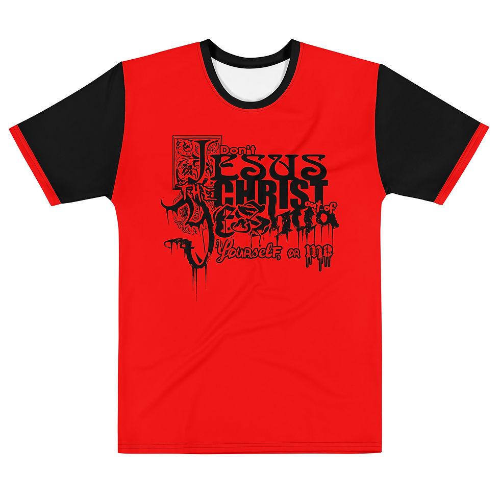
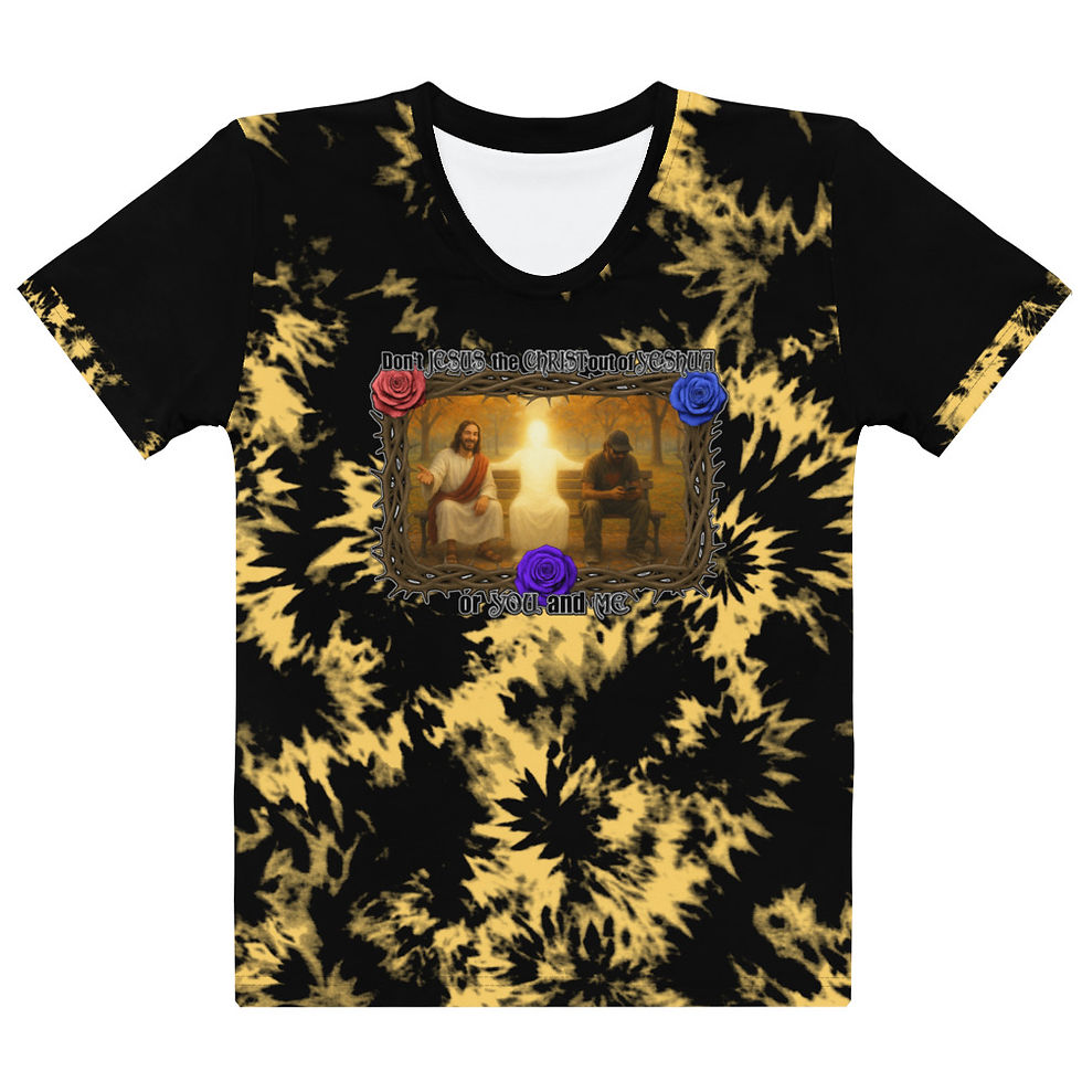
Don't "Jesus" The CHRIST Out of Yeshua, Your SELF, or me


AllLies (Red Flag) is one of those "political" statement designs. Politics is a bit of a crap thing to have an opinion about, mainly because (i believe) politics is just a part of the economic governance of humanity-- the business of regulating the flow of human currency (current-see). Politics eventually gets down to a bit of Stockholm Syndrome, building your own prison, and lovingly so-- or as much as people are led to believe they freely thought on their own. Living gets interesting like that. A lot of what's "reality" is someone else's plan. THE NAME? After a while, the allies are All Lies, and everything is a red flag. Still, since "they" feed on fear, you have to move accordingly.
THE DESIGN is actually one I'd been sitting on. This is one version of it. There were some slogans at the bottom of other ones, where there was a barcode in the bottom right corner, showing that some patriotism and beliefs are a product sold. It also said "All lives matter. This is business." Meaning that everyone counts, and since people (time, mind, and resources) are the currency, everyone is every one (like $1). There's a bunch of them in a collection I did years ago, but never got around to because I didn't have what I needed to do it how I wanted it done. I found PRINTFUL and CUSTOMCAT (print on demand companies), but had issues linking CUSTOMCAT to the websites, so i went with PRINTFUL, which was pretty close to what i wanted. The prices are a little higher, but everything can be reasoned when you're paying for it. Either way, I did this one as a test to see if it would come out good, which it did, so I guess I'll do more of the ones I was sitting on.
This section written 02.26.26- last edited 02.26.26
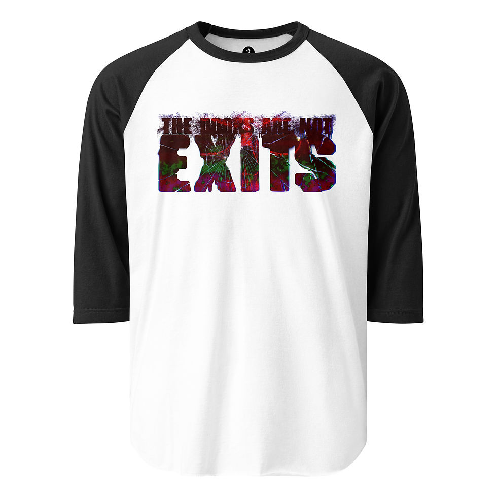
The DOORS Are NOT EXITS


THE BLACK KNIGHT is more of a style than a design, like the AGNINADI styled items. I guess you could call it something in the realm of a textile or swatch? A pattern? It's made of different shades of chainmail, with paisley to counter it, and plaid detail/edging. Pretty simple in a way, but you have to balance it correctly or it won't match. Too much of one, and it overpowers quickly, and can even look boring, or make the counter pattern look misplaced or unbalanced (naturally). Chainmail was always a cool thing to me. It was always like a person wanted scales, like they wanted the same protection as the dragons they were about to go to battle with. No, this isn't actual linked chainmail-- that might get heavy, but it looks cool, especially with the other patterns accenting it.
THE NAME? It just seemed fitting, since it's like a medieval jersey (pattern). Ironically, there's no Black Knight character in the series... yet. I know, DRAGONS, but no black knight. Meh.
THE DESIGN was honestly all about chainmail. Not chain letters. Chainmail, like suits of armor. I still have a project to do concerning this, which is building a jersey that's a samurai suit of armor. I just have to design the pieces separately, but this was a bit of a test run to see how the chain would come out, and i like it. I added the paisley to give it a little more edge, and then some plaid as a finer detail. It all worked really well... says me. The tricky part, or A tricky part, is keeping the aesthetic of it. Adding color would throw off the whole vibe. Some you can get away with, but the metal look has to be just right: the right amount of shading, highlight, "shine"... so that the gold looks gold and not yellow, or that any detail in a black mesh would even show up. I still have to work with this one more. There's only a few designs that I used it with. I guess it's a limited edition kind of thing.
This section written 02.28.26- last edited 02.28.26
Fire Warning


THE BLACK KNIGHT is more of a style than a design, like the AGNINADI styled items. I guess you could call it something in the realm of a textile or swatch? A pattern? It's made of different shades of chainmail, with paisley to counter it, and plaid detail/edging. Pretty simple in a way, but you have to balance it correctly or it won't match. Too much of one, and it overpowers quickly, and can even look boring, or make the counter pattern look misplaced or unbalanced (naturally). Chainmail was always a cool thing to me. It was always like a person wanted scales, like they wanted the same protection as the dragons they were about to go to battle with. No, this isn't actual linked chainmail-- that might get heavy, but it looks cool, especially with the other patterns accenting it.
THE NAME? It just seemed fitting, since it's like a medieval jersey (pattern). Ironically, there's no Black Knight character in the series... yet. I know, DRAGONS, but no black knight. Meh.
THE DESIGN was honestly all about chainmail. Not chain letters. Chainmail, like suits of armor. I still have a project to do concerning this, which is building a jersey that's a samurai suit of armor. I just have to design the pieces separately, but this was a bit of a test run to see how the chain would come out, and i like it. I added the paisley to give it a little more edge, and then some plaid as a finer detail. It all worked really well... says me. The tricky part, or A tricky part, is keeping the aesthetic of it. Adding color would throw off the whole vibe. Some you can get away with, but the metal look has to be just right: the right amount of shading, highlight, "shine"... so that the gold looks gold and not yellow, or that any detail in a black mesh would even show up. I still have to work with this one more. There's only a few designs that I used it with. I guess it's a limited edition kind of thing.
This section written 02.28.26- last edited 02.28.26


SOFTWARE? Photoshop. There was a whole "back and forth" process for this design. I did a sketch and then put that into Chat GPT. Then the image i got from Chat GPT i put into photoshop and fine tuned to get what i really wanted. I knew what I wanted in the image, so it wasn't much to it to do. I'm still working with this copy of Photoshop 6.0, so, yeah, whatever you're using is probably way better, so I expect you to do way more, way faster than me. I'm using what I have... that will actually work. I do still have the drawing tablet that works well... whenever THE HORSE (the laptop) decides to run it... properly. Sometimes it will run, but won't show me the icons/tools, or other features just turn off. Other times, even though I didn't do anything differently, it runs flawlessly. It's very frustrating, so unless I'm mentally prepared for that heartache and headache, I'll just do it the more tedious way in photoshop, using the mouse.
When it comes to using AI (GPT) it does that 80% - 90% thing, where it gives you like 80-90% of what you actually wanted, and then when you try to get it more exact, it goes in the other way just to piss you off and use up all of your credits or whatever (if you don't have a paid plan. If you do, it just messes with you because it's getting paid to do that. You paid it.).
THE DESIGN? It's a robot, representing AI (because that's what robots run on, even if it's simple basic programming), and the robot is dunking a human skull and spine. It's funny to me in a sarcastic, maybe even satirical way. The while idea of how that jump-man was first Jordan, which was representing one of the peak athletes in his prime, soaring, a master of his game-- now replaced by AI, and the AI is dunking him away. In a sense, humanity is the game-- not AI as most people would think, and it's being played out by itself, using AI. It's not really that deep.
I was going to be all technical and count out the spinal cord and vertebrae, but it didn't have to be that serious. ONE REASON I put THE SPINE in was because of Chrism Oil, and spiritual enlightenment. People go to AI for that now. Most of humanity, humanity's spine, it's backbone, is becoming more and more dependent on AI, and it's like humanity can't stand on it's own anymore, so... the spine. A headless, spineless humanity.
As far as the "full logo" with text, there were two designs done. The first one was the character (dunk-bot?), and the second one was just the text. Because Printful uses layers, I could then resize each piece (figure, and text) separately to get different effects (different color image and text), and placements (text above, behind, below, etc.)... but to have the whole design be more uniform I did a second one with the robot and text all on one image. Graphic designers do things like that. Most people who are not graphic designers would just do one design. The way I was taught to think was to make the design to look great in black & white, in multi-color, large, small, and everything in between-- which is why when you pa graphic designers to do things they give you so many options. We have to make sure that we cover all bases for you, and you image looks good on: t-shirts, fliers, business cards, letterhead, websites, billboards, stickers, pencils, etc. I bet that's why AI gives you the option to do 4 generations at once. Either way, i was making sure that i designed enough to work with the 5 layers that PRINTFUL gives you to work with. ALSO, some of the designs i was told to add the words "ARTIFICIAL INTELLIGENCE" so that people don't confuse AI (Artificial Intelligence) with AI (Allen Iverson) since it's a basketball'ish logo.
Here's a thing that bothers me... kind of a lot: "AI Artists" or the people claiming to be that. Stop doing that. If anything, you're a PROMPT writer, not even a coder, because it's not even code. You have to learn a whole lot more to learn to write code. Sesame Street can teach you to write a prompt. The AI does all of the work. If anything, the AI is the artist. It really bothers me when it comes to music, because music is such a universally soulful thing... or it can be. I only bring it up because this shirt pokes fun at that concept [of being an "AI ARTIST"]. Even more [disgusting?] is how people have businesses being content creators, and how they're flooding the market to make money, meanwhile, they have no love or passion, or event he slightest interest in what they're selling and/or making the AI "create" or put together. Because of that, the people who are trained to do those things, who are also passionate about that field, are being overlooked and underpaid, washed out by the AI oversaturation. It's the whole soul and spirit of humanity being sucked out, and the shell of it being fed a photocopy of it, and not even a good one. That's one of the messages at the heart of this shirt.
Written 11?.??.25 .... last updated 02.26.26