
MERCH & IMAGE BREAKDOWNS


Created/written: 02.28.26
LAST EDITED: 03.05.26
AT THE END OF EVERY SECTION is a VIDEO PLAYLIST of ALL OF THE PRODUCT BREAKDOWNS (that have videos), and also THE FULL LIST OF ALL PRODUCTS AND CATEGORIES so you can get to what you came here for easily. Each section should have a comments section if you have any comments or suggestions on that design or the products. OR YOU CAN CLICK HERE TO GO TO THE STORE.
Graphic design one of the thing I've come to do, and after having done it for a little while, I gotta say, it's pretty fun to do... when you're doing it for your self. Building your own brand is a whole other world, so if you're on that path, here's some of the behind the scenes in the whole "clothing brand" side of Samurai Ruach. Designing is great, and the most fun part for me, and maybe for you too, but I have to do all of the other parts as well, and unless you have a team or some top notch AI agents, it becomes a balance and battle of staying motivated to set goals and do all of the boring crap that "someone" has to do but there's no one but you to do them... staying inspired to keep creating and keep the fire and passion for what you love doing... even staying on top of things like technology in your field and trending themes. If you're into doing print-on-demand, there's keeping tabs on the leading products, methods, and companies, I get into a lot of these things, and you see it in real time, in the videos. Not only that, but if you were looking for the meanings to the designs-- because there's a lot packed into them, and how they were done, you're in the right place. I've done some written blog posts if you're a reader, and because of how things are as far as living situations, doing videos ended up being faster, so here's both.


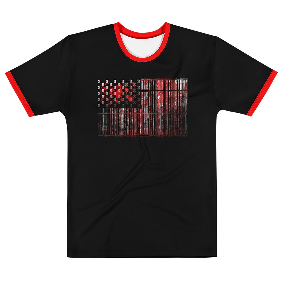
THE BLACK KNIGHT is more of a style than a design, like the AGNINADI styled items. I guess you could call it something in the realm of a textile or swatch? A pattern? It's made of different shades of chainmail, with paisley to counter it, and plaid detail/edging. Pretty simple in a way, but you have to balance it correctly or it won't match. Too much of one, and it overpowers quickly, and can even look boring, or make the counter pattern look misplaced or unbalanced (naturally). Chainmail was always a cool thing to me. It was always like a person wanted scales, like they wanted the same protection as the dragons they were about to go to battle with. No, this isn't actual linked chainmail-- that might get heavy, but it looks cool, especially with the other patterns accenting it.
THE NAME? It just seemed fitting, since it's like a medieval jersey (pattern). Ironically, there's no Black Knight character in the series... yet. I know, DRAGONS, but no black knight. Meh.
THE DESIGN was honestly all about chainmail. Not chain letters. Chainmail, like suits of armor. I still have a project to do concerning this, which is building a jersey that's a samurai suit of armor. I just have to design the pieces separately, but this was a bit of a test run to see how the chain would come out, and i like it. I added the paisley to give it a little more edge, and then some plaid as a finer detail. It all worked really well... says me. The tricky part, or A tricky part, is keeping the aesthetic of it. Adding color would throw off the whole vibe. Some you can get away with, but the metal look has to be just right: the right amount of shading, highlight, "shine"... so that the gold looks gold and not yellow, or that any detail in a black mesh would even show up. I still have to work with this one more. There's only a few designs that I used it with. I guess it's a limited edition kind of thing.
This section written 02.28.26- last edited 02.28.26
Created/written: 02.28.26
LAST EDITED: 03.05.26


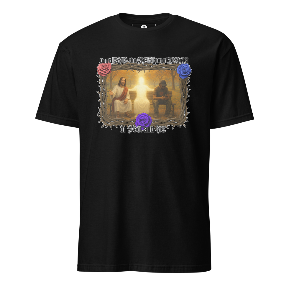
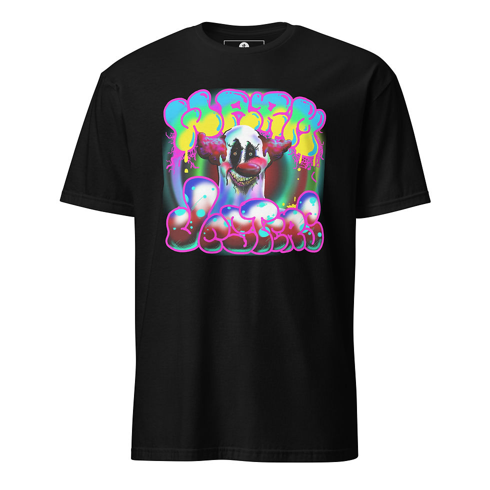
VESTI LA GIUBBA (e la faccia infarina. La gente paga, e rider vuole qua.)... Honey of a quote, ain't it?! There's a video and a whole playlist just for this, which is below. This phrase is kind of where the RUGPULL design came from, why THE ZEPHANIAH CHESTERFIELD PROJECT, and why a lot of other things... for me. ay it for me, and when it lifts someone else up, and they thank me for it, then that will be the kickstart i needed to get back into the positive zone. T-shirts do that. It's one of the reasons I do t-shirts-- to say the things people can't, but want to, or need (to).
THE MESSAGE is a quote from PAGLIACCI the opera, which says:
"(Vesti la giubba)......... Put on your costume
(e la faccia infarina)... and apply make up to your face.
(La gente paga,)......... The people pay,
(e rider vuole qua.)..... and they want to laugh.".
What all of that means to me, if you didn't see the explainer video about the lineup, is how you have to put on your face (makeup your mind) and also build your self physically and tangibly (body & soul) to play this game. By "play this game" i mean come to this world as a human being (makeup and costume), where people pay (trade currency & current-see) by way of soul and spirit energy transactions, thinking of thoughts (currency) to manipulate reality (current-see), because they WANT to laugh, or have a good time, make memories, and gain on their investment in conscious being, because we're all staring down the barrel of eternity which is a loooooong time to not have anything fun or good or light to look back on. SO, get yourself right, and be your honest self, live and be that, so you can enjoy the show (this war-- in and of the mind). C'est la vie (that's life and living it), la guerre (the war/ the mind), et le jeu (and the play/ the game).
THE DESIGN was done in Photoshop 6 like all of the others. I didn't record it because i wasn't thinking to, for one, and also because I was having so many issues with it, and memory-- it not wanting to save, and me going through that whole process of deleting things, clearing cache, etc.... that i was just happy to get it done. Get what done? OH, right... SO... (and this is in the video) what i had to do was, make a half black/half white paisley card to use as the background, and then an opposite one white/black for the reverse side, so that the image front and back would have one solid left side color, and one solid right side color. That's how one side of the shirt is black and the other side is white/silver. I used the same cards for the sleeves. Having both colors on one card saves layers-- as opposed to having one black layer and a white layer, they're both on the same layer as one solid image. THEN i redesigned the "3 SPIRITUAL RELATIONSHIPS" chart image, and fused it with the "Creation of BEING(?)" image, so, again, there's two images made into one image to save layers. I took one of the masks from THE BOOK OF THE CLOWN (cover) from that book that i think is on Patreon, but nowhere else. It might still need to be worked on. Living took a turn when i was working on updating it, so, what's there is there.
I know there are a few videos in the playlist for this design. As of today (2.26.26) i probably still have videos of this design that need to get edited. Yay life. I still got time.
Send In The Clowns
Send In The Clowns

The Master Clowns (Clown History)

Warm Jesters Drawing

2025 12 19 12 12 44 Feel Spirit Touch Logic
Created/written: 02.28.26
LAST EDITED: 03.05.26
NOTE: The items above go from TRYANGLES (Clown) to TRY ANGLES (Mask).


VTRYING TO HAVE A NICE DAY is about exactly that... TRYING to Have A Nice Day. I did a few different versions of the face there, because each time it almost feels like what I was going for, but never quite exactly it. It's a work in progress, but i just put all of the work out until I get what I'm aiming for. Later on, since there were a few different ones I just designed a face to fit the moods, instead of making one face and limiting it to the moods. For instance, if you took Charlie Brown's face and made him angry, sad, happy, confused... versus making a face specifically to express each of those things, so the face and design is more pure and honest.
THE MESSAGE is a simple one... "I'm TRYING to have a nice day." This is what it looks like. Everyone is fighting a battle, which is dumb honestly, but everything is something to do, and all things have to be expressed by sone version of one, in one moment. Yeah, its a play on the "Have A Nice Day" shirts because sometimes you just want to slap the people wearing those, like, "I'm TRYING but everything is against me, and I don't need your shirt rubbing it in my face on top of that. I should punch you in your shirt face, but that's even MORE CRAP that i'd have to deal with, and all i did was be born, which i had no choice, and now I'm just trying to have a nice day." Yeah, that's a little long, but you get the point. Life is life. Living is what we make of life-- how we see it, what we want from it, what gets done... it's the twisting and manipulation of what's actually there. We don't always see the Nice Day in the moment.
THE DESIGN was done in Photoshop 6 like all of the others, with some AI help. I basically made a distorted happy face, but several versions, and then took the parts that came out how i wanted them to come out (because AI specializes in NOT giving you what you asked for, so you can keep playing the game), and then I put them all together in one face in photoshop, and manipulated them a little more there. In future versions, the drawing pad was working with the laptop, so I just drew them out. When it's working I have to strike when the iron is hot.
Created/written: 02.28.26
LAST EDITED: 03.05.26


TURN YOUR FROWN (Something Something...) Yeah, there's a lot of honesty in these designs. Every t-shirt should be an honest from the gut, heart, soul, and mind statement-- even if it's just an image. Like music, a t-shirt is a vibration people go out and get. They raise or lower their self to the vibration, or mindset, that the song and t-shirt has. You literally walk around in that energy, and not only bring it into your self but you share it with others. They catch the vibes. SO... even if sarcastic or edgy, regardless of how cool they look, I still try to put out some energy that will help someone get to a better place. It's so they can express their self even when (especially when) they don't know how.
THE MESSAGE is a fun one, based on a combination of an old popular phrase, "Turn Your Frown Upside Down," and the fact that not everyone is in that frame of mind when they're trying to do it, which is why the phrase even comes up. Some folks are trying to have a nice day but might not be there just yet. And YES, it is good advice, but people have to b in a position to receive that advice AND to put it to good use. So, their heart and mind might be trying to turn their frown, but life and living it are having a rough time, so it comes out a bit grumbly, "Turn Your Frown... something something." They're trying to turn it, but not sure which way, or what good it'll do... but, still trying. It's like, "Yeah yeah yeah, I know... I'm trying.. shut up and mind your own business."
THE DESIGN goof old Photoshop 6 like all of the others. The smile on the face is actually the word "FROWN" in the shape of a frown, turned upside-down. I remember recording the making of the design but can't remember if the video was edited, or where it went (as of today 04.05.26). But, yeah, it's "FROWN" that I sketched out to look like a jagged, almost jack-o-lantern teeth or something, so when flipped it's a jagged kind of smile. Then i just turned the frown upside down.
Then there's the part where people might not be able to read the "FROWN" or understand the design, and just see a creepy smile-- which is a cool side-effect, but might be distracting, so i just made a text image and put that on the back. I was going to put it on the front, but for one, to me, it would read weird "Turn that Frown... FROWN... Something Something" if curved around the image. Basically it would have the word FROWN in there twice, so if all of the words were on top, or on the bottom below the design, it would look funny-- to me. SO, i did it 2 sided.
2-SIDED PRINTS VS ALL-OVER PRINTS... The only gripe with 2-sided designs is they add an extra $5-$6 to print on the back, which raises the price of the shirt-- not really what you want when you're trying to keep costs low and keep the shirt affordable. True, it does add more value, but the production costs goes up. To get around that, I could do the "ALL-OVER PRINT" designs, which is an all white item that gets printed all over it, so if it looks like a yellow shirt with black lettering, both the yellow and black are printed. There's one flat price for the print, which can be less than the regular 2 sided prints because with the all-over prints, the WHOLE ITEM (shirt, hat, bag, etc.) is one print. The only drawback there is with the all-over prints you only get the one print (one color shirt), whereas the traditional more expensive prints you get to choose different shirt color options. Bigger print area, so cooler designs vs only one single item that has to be redone for every other color, and also split between 1 men's and 1 women's (and youth, or boys and girls, etc.). Another way to look at that is you get a more expensive, multi color option, basic image, unisex shirt, by printing one design onto multiple sides of whatever color unisex shirt is picked, which saves space... or... a less expensive, one color option, better design, single sex shirt, by printing one design onto a fabric made into a shirt, so you have to design more of them which crowds the store.
Created/written: 04.05.26
LAST EDITED: 04.06.26


M E N U
EXPLAINER VIDEOS (Merch, & Images)
EXPLAINER VIDEOS (Merch, & Images)

CRAZY TALKS #49: NO OTHER GODS BEFORE WHO? (02.05.26)

Crazy Talks #52: I HOPE THIS HELPS TOUR (hacked for social media - 02.05.26)

Crazy Talks #30'Something: "HONEST Real Talk" (01.24.26)


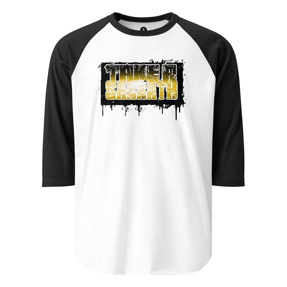
ALL DESIGNS: Agnanadi; AllLies; The ArtWork's Outside The Box; BEING Symbol (Classics); BEING Symbol (Skull version); BEING BE-ing Being (Str8 Outta); BLACKLIGHT; Blacklight Quotes (Be Honest); Blacklight Quotes (No One Or Thing...); Blacklight Quotes (One Fire To Another); Blacklight Quotes (Peace & Blessings); Blacklight Quotes (The Only Thing Illegal...); Blacklight Quotes (You Still Have Time); Black Knight; Boney Phace; Charlie Beats; Coal Diamond; DefTrap Ronin; DefTrap Ronin (B.EL.YEWS); DefTrap Ronin (kNo Choice); DefTrap Ronin (The ONE); Don't Jesus The Christ Out of Yeshua, Your Self, or me (Artist & Park); THE DOORS ARE NOT EXITS; Fire Warning; Frank V. Durden; For Shore; Future's So Bright; Garuda VI; Get Crossed At Your Own Risk; Green Hero Man Guy or Girl Woman Person Thing; HappAi Face; Head In The Clouds; I Love Um...; I'm Doing My Best; Just Let AI Do It; Kemuri Ashain; Meditate On The Word Night & Day; Mind Over Matter (Game); NOT OK; OM-A-ZING; Rugpull (The Seein' Clown); Samurai Ruach (brand); Shmokey Phace; Sky's The Limit; Take A Sabbath; TryAngles; Trying To Have A Nice Day; Turn Your Frown something something...; Vesti La Giubba; Warm Jesters; WorldWide Royalty (WWR SERIES); You Fell Asleep On Purpose;
COLLECTIONS/ CATEGORIES: Agninadi (Fire dragon); Bags; BEING Symbols; Blacklight Vibe; Books, Games, & Music; Coal Diamond; Computer Love; EVERYTHING ELSE; Garuda VI; Hats & Headwear; Jackets, Jerseys, Long-Sleeves; Ladies Only; Mainly Text; Rugpull's Big Top; Samurai Ruach (Brand); Spiritual Fire; Tees (Raglan baseball tees); Tees (short-sleeve & tanks); Trying To Have A Nice Day; Vibrant Vibes; WorldWide Royalty (WWR); .