MERCH & IMAGE BREAKDOWNS


At the top (after this), somewhere in the middle of this page (it's a long page), and at the bottom are PAGE MENU's that have all of the designs to look thru. There's also a video playlist of all of the product videos, explainers, demos, etc.
Doing graphic design for other people is ok. It's great when they know what they want, and communication is there, and the equipment works, and there's clear deadlines and everything else. Still, it's not as fun or fulfilling, or at least that's been my experience. I mean, yeah, yay, they get what they wanted, but I've seen so much nothing come of hard work I've done for others, on top of cutting them a break (deals, free stuff, etc.). I've even told people to pay me what it's worth when they get to the position where they could pay me, if they couldn't at the moment, or were just too "poor" in their mind and spirit. Using your time, mind, and resources to help bring someone up to a level where they can do the same with their time, mind, and resources (money, talent, skills, connections, etc.)... but to be burned way more than you've been blessed makes you stop doing a lot of things. So, there's this.
All original designs. I know some pirates, and this world is crooked, so as much faith I'd like to have in humanity not stealing things, look at the people who are "on top" who "run everything," and then look at the people trying to keep up with them, or working for them, or living as a reaction to them. This life is a soul sucking hole, as planned and created to be-- just one way of seeing it. I see it other ways, in those moments, especially when immersed in distractions, but largely...? "Soul sucking hole." So, while watching it all burn, which isn't a bad thing-- it's just a thing... here's this to help whoever it helps, however it helps. I'd like it to be a positive "good" help, and for it to help others realize and walk and be in their purpose and divinity, but... we've come here partly to escape that, because we return to it when we leave here, so... it's tricky. Still, "all the best" as they say. C'est la vie, la guerre, et le jeu.
This section written 03.13.26
LAST EDITED: 03.13.26
shop | breakdowns menu | home | site menu
EXPLAINER VIDEOS (Merch, & Images)
EXPLAINER VIDEOS (Merch, & Images)

CRAZY TALKS #49: NO OTHER GODS BEFORE WHO? (02.05.26)

Crazy Talks #52: I HOPE THIS HELPS TOUR (hacked for social media - 02.05.26)

Crazy Talks #30'Something: "HONEST Real Talk" (01.24.26)
M E N U


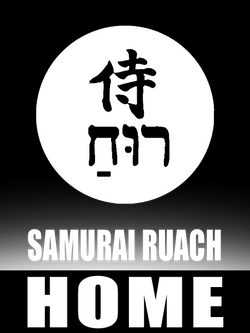
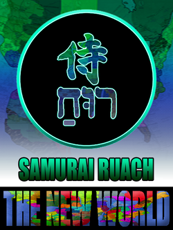
ALL DESIGNS: Agnanadi; AllLies; The ArtWork's Outside The Box; BEING Symbol (Classics); BEING Symbol (Skull version); BEING BE-ing Being (Str8 Outta); BLACKLIGHT; Blacklight Quotes; Black Knight; Boney Phace; Charlie Beats; Coal Diamond; DefTrap; Don't Jesus The Christ Out of Yeshua, Your Self, or me (Artist & Park); THE DOORS ARE NOT EXITS; Fire Warning; For Shore; Future's So Bright; Garuda VI; Get Crossed At Your Own Risk; Green Hero Man Guy or Girl Woman Person Thing; HappAi Face; Head In The Clouds; I Love Um...; I'm Doing My Best; Just Let AI Do It; Kemuri Ashain; Meditate On The Word (Day & Night); Mind Over Matter (Game); No One Or Thing...; NOT OK; One Fire To Another; Peace & Blessings; Rugpull (The Seein' Clown); Samurai Ruach (Brand); Shmokey Phace; Sky's The Limit; Take A Sabbath; TryAngles; Trying To Have A Nice Day; Turn Your Frown something something...; Vesti La Giubba; Warm Jesters; WorldWide Royalty (WWR Series); You Still Have Time;
COLLECTIONS/ CATEGORIES: Agninadi (Fire dragon); Bags; BEING Symbols; Blacklight Vibe; Books, Games, & Music; Coal Diamond; EVERYTHING ELSE; Garuda VI; Hats & Headwear; Jackets, Jerseys, Long-Sleeves; Ladies Only; Mainly Text; Spiritual Fire; Tees (Raglan baseball tees); Tees (short-sleeve & tanks); Trying To Have A Nice Day; Vibrant Vibes; WorldWide Royalty (WWR);
The Black Knight


THE BLACK KNIGHT is more of a style than a design, like the AGNINADI styled items. I guess you could call it something in the realm of a textile or swatch? A pattern? It's made of different shades of chainmail, with paisley to counter it, and plaid detail/edging. Pretty simple in a way, but you have to balance it correctly or it won't match. Too much of one, and it overpowers quickly, and can even look boring, or make the counter pattern look misplaced or unbalanced (naturally). Chainmail was always a cool thing to me. It was always like a person wanted scales, like they wanted the same protection as the dragons they were about to go to battle with. No, this isn't actual linked chainmail-- that might get heavy, but it looks cool, especially with the other patterns accenting it.
THE NAME? It just seemed fitting, since it's like "a medieval jersey" (pattern). Ironically, there's no Black Knight character in the series... yet. I know, DRAGONS, but no black knight. Meh. I honestly don't know anything about the actual "real" BLACK KNIGHT. Imagine that... in the google era... WITH AI?!?! No, I'm not looking it up either. You can if you want.
THE DESIGN was honestly all about chainmail. Not chain letters. Chainmail, like suits of armor. I still have a project to do concerning this, which is building a jersey that's a samurai suit of armor. I just have to design the pieces separately, but this was a bit of a test run to see how the chain would come out, and i like it. I added the paisley to give it a little more edge, and then some plaid as a finer detail. It all worked really well... says me. The tricky part, or A tricky part, is keeping the aesthetic of it. Adding color would throw off the whole vibe. Some you can get away with, but the metal look has to be just right: the right amount of shading, highlight, "shine"... so that the gold looks gold and not yellow, or that any detail in a black mesh would even show up. I still have to work with this one more. There's only a few designs that I used it with. I guess it's a limited edition kind of thing.
Yeah, this page is in order (A-Z) so Black Knight is before Black Light, but I like the blacklight stuff a little more, so I put it first a lot of the time. Now you can't unsee that.
This section written 02.28.26
LAST EDITED: 03.13.26
shop | breakdowns menu | home | site menu
Blacklight


BLACKLIGHT is an often referred to thing (metaphor, philosophy, etc.) in the Samurai Ruach work. On the "WAY OF THE SAMURAI RUACH" page, there's a section on the Blacklight Path, which is a way of being with Blacklight as the main metaphor. The way is rooted in "Seeing the light in darkness, and the darkness in light." Through this everything is everything, and from there, can be whatever you want it to be, even though you know it is what it is. From there, you'll not even want what is, but just have the awareness, and the knowing of it consciously. It's liberating. The only issue "here" is the distraction, which, "C'est la vie, la guerre, et le jeu."
Blacklight Fire is a reference for the style of fire in a Blacklight individual. It is one of the most intense, if not thee most intense, so much so that it is "unseen" even in plain sight. This light is what people love, because of the brilliance they see WHEN IT COOLS DOWN and lowers itself. A lot of the times, Blacklights are very sarcastic, and can be "dark", and even seem slow, but it's because they're so honest and blunt they seem like they're joking and that gets annoying, so bright they're not really seen, and so fast they've lapped you a few times, and when you look back, you see them coming up behind you and you think you're ahead. And we have to let the world think these things. It just stirs that fire even more. Very few things (outlets, relationships, individuals, drugs and distractions, etc.) survive that fire. Drawn to things people run from, and things people run from are drawn to you. All of the ones are the same, and replaceable, yet the ones you'd like aren't allowed, and the ones that are are... interesting. These things and more.. C'est la vie, la guerre, et le jeu. Let your light shine, regardless of everything else. You don't have a choice, consciously, honestly. THE DOORS ARE NOT EXITS.
Fire can have different colors that can show different intensities, with the blue flame being one of the hottest burning ones. When looking things up on this i found: Dark Red (first visible glow): ~500°C–600°C (932°F–1,112°F), Dull Red / Cherry Red: ~600°C–1,000°C (1,112°F–1,832°F), Orange: ~1,000°C–1,200°C (1,832°F–2,192°F), Yellow: ~1,200°C–1,400°C (2,192°F–2,552°F), White: ~1,400°C–1,600°C (2,552°F–2,912°F), and Blue: ~1,600°C–3,000°C+ (2,912°F–5,432°F+). I first became interested in this when in chemistry class, and saw Skip Orhowsky (forgive the spelling) burn copper and it burned green. Iron burned blue. It was fascinating that different things burned different colors, and different things had different melting points. ANYWAYS, i came up with the concept of BLACKLIGHT FIRE when thinking about anti-matter, the veil, and other "unseen" and "unknown" ways of BEING, and since everything exists, there is some fire that cannot be seen. Things in the ultraviolet spectrum for instance... and it clicked-- "Blacklight Fire." The heart and fire of Blacklights.
THE DESIGN was pretty easy and clean. I wanted a font that looked like a neon light, with the colors of a blacklight in it. Trickier than you'd think, given all of the fonts out there that look like blacklights (neon lights and signs). I'm gonna mention a few that might be linked to google searches (the ALL page), and you can click on the IMAGES in the link to see what they look like. Bauhaus (93) was one of the O.G.'s, if you know that font. There's one called PRICEDOWN which looks like "the Price Is Right" aka "Grand Theft Auto." When you do graphic design, you kinda nerd out on those things.
It's frustrating when fonts vanish too. Like VINER HAND (ITC) i think it was called... which was really cool to me. Kind of a desert oasis thing going on. There's all sorts of ones that look like neon lights and signs though. Some that connect, and others with separate letters (spaced). Some rounded, some squared or angled... Ones that look girly... ones that look too cartoony. Finding the perfect balance is the key. Also, the shirt you put it on matters, so you need something that'll work on every kind of shirt, and then, in colors that would be neutral enough to work with most (if not ALL) colors. Adding a light source to a light is interesting as a concept-- how do you add shadow to a light? The same as you do with all things. Pick a light source, in this case, above and to the left, and then have the shadow on the opposite diagonal side (bottom right).
After having said all of that, i completely forget the font I used. I could look it up, but as of today (3/12/26, at 9 am... AM being Ante meridiem (before mid-day)... not Anno Mundi, which would be interesting, because this post would be extremely old, and technology should be way more advanced than it is if I could post this as 9AM), i have a lot on my plate already, and I'm going to be lazy there and not look that up. C'est la vie, la guerre, et le jeu (as it's been said here). More than likely, i got it from 1001FreeFonts.com. 1001FreeFonts.com is a big deal to me. It's nice to have a place you can go to and rust to have an easy way of finding fonts, and seeing samples ("The quick brown fox and the lazy dog" or whatever it is) to help you decide. Sometimes when doing logos, like this one, you want certain letters to stand out. Things like the lower-case "g" with the tail at the bottom-- some fonts curl it into a loop like the one I used, others curl to the left, or right, or do some weird stuff. Some turn to underlines. Yeah, you can always manipulate and customize the font later after rasterizing it, but have your core design down by that point so you don't lose resolution/pixel quality, and overall design integrity. Using a grid and guidelines helps. I know, that's a lot for one word. "Just Let AI Do It!" well, then I didn't do a design, and i wouldn't be an artist. I'd be an android zombie in hollow town, Soullessville, USA. Nope, I'm a human being. We create. We do things.
This section written 03.12.26
LAST EDITED: 03.12.26
shop | breakdowns menu | home | site menu
Blacklight Quotes


THE BLACKLIGHT QUOTES are some phrases and pages from THE BOOK OF BLACKLIGHTS, and some of the other "practical spirituality and philosophy" books done in the Samurai Ruach collection of writings (outside of the "fiction" sci-fi series). No punches pulled in some of these. It's all opinion (of course), based on life and living it, here in this "reality" or Matrix, or whatever you want to call it. They're things about BEING, some keys to freedom, and principles of the BLACKLIGHT PATH. You can check out more about that whole philosophy on the WAY OF THE SAMURAI RUACH page. While writing this, i noticed it got long. Just a heads up.
PEARLS BEFORE SWINE is a thing, also, in Samurai Ruach. Don't waste your currency (self). There's a lot of sarcasm here, mainly because of the degree of honesty in the thoughts shared. The sarcasm takes the edge off of that whole "pearls before swine" thing. Of all of the wisdom and understanding there is to gain, have, ands share in this "reality", what is the point of it? How much of what you learned in all of your years in schooling, being "educated" for your future-- how much is used, and how much is wasted? What are you doing with it and why? Now, take that answer, and remove economics (survival because you're buying things to live, and procreation... which is survival-- continuing your line), and what would you come up with? A lot of it you only use when you have kids, trying to remember it to help them with their programming and induction into the system that's draining you now.
Wisdom and understanding... great to have, but why? It's like having a yard for most people. Not a flower or tree in it, no food, nothing to relax, no family members buried in it so they can't take "your land", no clothes lines (no use of it's many functions)... you don't stand barefoot in it to ground yourself or recharge... usually it's just a bathroom for dogs we use to amuse us and call it "support animals" which is just de-stress from the torture we're going to go back to animals, or you have a grill in it, covered up, and some storage stuff rotting in a pile housing bugs, until summer when you have to deal with it. This glorious, bountiful yard is just this annoying thing you have, that you may use to impress others, but it's mostly just a hassle you figure is just something that comes with the territory. Wisdom and understanding are the same, largely. They could do a lot, but most of this living, rooted in distraction and division, most of it we do on autopilot. Very seldom are we fully, wildly, unsuppressed in our BEING, and that BEING passionate. Very rarely does the light shine brightly. You're driven to use them. They're really survival tactics. When everything is fine, how much wisdom do you need? When you're at peace, in your fullest most sabbath state, how much wisdom do you have, want, or need to apply? For what? There's nothing to do but BE. If not for survival, or lost in just purely being, then it's some party trick, or something to do to amuse yourself-- just a thing you want because you're conscious and that leaves you prone to want things. SO, on a t-shirt or product is a nice place to put things-- like in books. If someone is serious about it, they'll get it and use it. Everyone else will pick up the trend, get what they want, but not have what they have, and run to another portion of the loop. Either way, I did my part.
C'est le jeu (that's the game, that's the play). BUT, here we are in this game. OR... SO here we've come to this game. You'll not have it when you come here, even though you do... and then you'll gain it (which you already have), and then you'll leave it all behind to play the game again, or opt out and then pick it up later. Added to that, some of the main things in this "reality" are the "D"s: Distraction, Deception, Division, Diversion, Delusion... things of that nature. It's getting ONE to be more than that so that there is a vibration. Given all of that, what you end up with, is infinite beings, with all of the knowing and awareness, which become conscious, and in that... want something to do. And they'll want everything eventually, and once they get it, then what? Start over. For eternity. So, since part of the point of this dream we're in, is BEING asleep, the opposite of awakened, to awaken folks would be counterproductive, and telling them liberating things, as honest as it is, would be more rejected because people are here for the lie and deception, distraction, division--especially from their full self. Those who distract and divide know this, which is why it works so well here. If i told you that, it wouldn't be received well. Reading it is half received well... but on a t-shirt, it's free, quirky, funny, amusing... acceptable, especially since you pay for it, then you have power over it, and ownership. For some reason think things they pay for are more valuable, even though rarely do they want to pay what it's worth. You fill the wanted lack with another want, something fulfilling, so you can want something else. The illusion of lack gives you space to chase and fill, which creates purpose. In your wholly complete full state, there's nothing left. In a sense, "At the top, there's nowhere to go but nowhere, down, in circles, or further up because the top is an illusion." Yes, that's one of the designs, lol.
THE DESIGNS are usually all text. Keeping true to the "this is a quote from a book" theme, it just makes sense to keep them as based on text/typography as possible. The BLACKLIGHT design talks about working with text designs, but basically, when all you have is letters, it's a cool challenge. You're limited to the character of the characters. After that, it's you vision of the layout of those letters-- what can you build with it. How do you paint the picture. Some just play it straight, with one font, which seems more bold and impacting because its so direct.
Yeah, technology's making things interesting, but I don't have that yet. I dreamed to have one of those cloth tv screens as a shirt fabric for jackets, front panels of hats (or the whole thing), and especially t-shirts, so then the typography would be that kinetic typography. TIME, MIND, and RESOURCES-- everything in creation and manifestation comes down to that. Everything in conscious being comes down to that. IF YOU HAVE THE TIME, MIND, AND RESOURCES, and how you apply them. I'll have some of those, here and there, but they don't line up usually. The resources part is lacking. But this reality is about lack, so, along with how it's allowed, it's also a part of the game. C'est la vie, la guerre, et le jeu. You honestly have all three (TIME, MIND, and RESOURCES) but the game gets you to play by rooting you in one, and getting you to sacrifice the second to gain the third. You can look at the "YOU STILL HAVE TIME" and the "TryAngles" designs to see a bit more on that. They're kind of a part of this group. In fact, I'll list a few other ones which are a part of this group of BLACKLIGHT QUOTES. I'll toss in some samples of all of that if I can find it.
SOME OTHER DESIGNS WITH BLACKLIGHT QUOTES/Themes:


This section written 03.12.26
LAST EDITED: 03.12.26
shop | breakdowns menu | home | site menu
EXPLAINER VIDEOS (Merch, & Images)
EXPLAINER VIDEOS (Merch, & Images)
CRAZY TALKS #49: NO OTHER GODS BEFORE WHO? (02.05.26)
Crazy Talks #52: I HOPE THIS HELPS TOUR (hacked for social media - 02.05.26)
Crazy Talks #30'Something: "HONEST Real Talk" (01.24.26)
M E N U
ALL DESIGNS: Agnanadi; AllLies; The ArtWork's Outside The Box; BEING Symbol (Classics); BEING Symbol (Skull version); BEING BE-ing Being (Str8 Outta); BLACKLIGHT; Blacklight Quotes; Black Knight; Boney Phace; Charlie Beats; Coal Diamond; DefTrap; Don't Jesus The Christ Out of Yeshua, Your Self, or me (Artist & Park); THE DOORS ARE NOT EXITS; Fire Warning; For Shore; Future's So Bright; Garuda VI; Get Crossed At Your Own Risk; Green Hero Man Guy or Girl Woman Person Thing; HappAi Face; Head In The Clouds; I Love Um...; I'm Doing My Best; Just Let AI Do It; Kemuri Ashain; Meditate On The Word (Day & Night); Mind Over Matter (Game); No One Or Thing...; NOT OK; One Fire To Another; Peace & Blessings; Rugpull (The Seein' Clown); Samurai Ruach (Brand); Shmokey Phace; Sky's The Limit; Take A Sabbath; TryAngles; Trying To Have A Nice Day; Turn Your Frown something something...; Vesti La Giubba; Warm Jesters; WorldWide Royalty (WWR Series); You Still Have Time;
COLLECTIONS/ CATEGORIES: Agninadi (Fire dragon); Bags; BEING Symbols; Blacklight Vibe; Books, Games, & Music; Coal Diamond; EVERYTHING ELSE; Garuda VI; Hats & Headwear; Jackets, Jerseys, Long-Sleeves; Ladies Only; Mainly Text; Spiritual Fire; Tees (Raglan baseball tees); Tees (short-sleeve & tanks); Trying To Have A Nice Day; Vibrant Vibes; WorldWide Royalty (WWR);
Boney Phace


BONEY PHACE is fun. There's a lot of honest sobering reality in it as well. Making light of what's usually used as a "darker" thing (skulls), only dark because of morons and their manipulation of a natural thing (skulls), this design was done to make light of all of that. Not to "make fun" of all of that, but to make "light" of all of that-- to restore it to it's natural, more peaceful, sobering and honest side of that reality. The videos say a lot, because i wasn't sure if I would have the time to write all of this out, and then condense the writing to make it phone friendly, but screw phone friendly-- if you're here, you're here for the designs and reading this to READ about the design, so screw holding back and making this page cute.
People see skulls and they think "Death." Either that, or some kind of GOTH whatever. Skulls were around since ADAM--if you want to be biblical, or just practical and honest about it, but even before then, when the other animals and beings that were in existence in some tangible or physical form, and had faces, there was more than likely a skull under that face, helping that individual to not drown or suffocate from their flappy face skins clogging their own airholes. Without a skull, we'd be gurgling fart speech. They're as natural of a thing as any tangible, physical thing could get. Humanity is (possibly) the only creature that glorifies and revels in the ignorance of death, yet, deals the most of it in that same glorified ignorant b.s.-- just being honest, but it's a personal opinion.
THE NAME? It's a play on words, which a lot of things are me playing with words (vibes, ideas) to make an image of that-- so a lot of the images are "one picture that is worth a thousand words." BONEY makes light of Bones (Skulls) showing how childlike it is. Humanity isn't a long thing. You're born a baby and leave as a child still. If you can retain your childlike self in that process of being a child on this planet, then awesome. A lot of soul gets swallowed. Whatever's swallowed gets recycled, as well as what doesn't get digested and is returned-- deposited. Anyways, that's the BONEY part-- humanity is a child. The PHACE part is a mix of Face and Phase. So this childlike humanity you have here is just one of the many faces of your sabbath (Wholly holy) self. It's just one part of you. That one part is just a phase. You'll grow into it, and through it, and then beyond it. You keep going forever, so have a bright colorful, fun, childlike BONEY PHACE.
THE DESIGN was fun to do. The tablet was working, so that was great. There's a video on the creation of this whole thing. I was doing a series of "smiley faces" and there was this one, and one that I haven't really released yet because I keep planning to go back and do some of the details differently (the red-spirited one with the blood splatters on it). Some small set-backs and issues, but the vibe was fun, and everything was clicking more or less, so doing this one was easier than some others. Getting the colors was interesting. I had an idea of what i wanted, which is normal, and in that, I'll start with what I'm seeing in my head, and then let the design work itself from there to see what comes out. Done it in the same old Photoshop 6 i have. Done it on the same HORSE (laptop) i have. I think i was able to sit and do it all in one day, which was cool. Time works funny here. You'll think you'll have some "free" (you) time but it will turn into something else. Like, even me typing this seems like free time but it's work, kinda, and I haven't really started the day. I just rolled over, grabbed the keyboard and mouse, and started in.
This section written 03.01.26
LAST EDITED: 03.12.26
shop | breakdowns menu | home | site menu
Charlie Beats


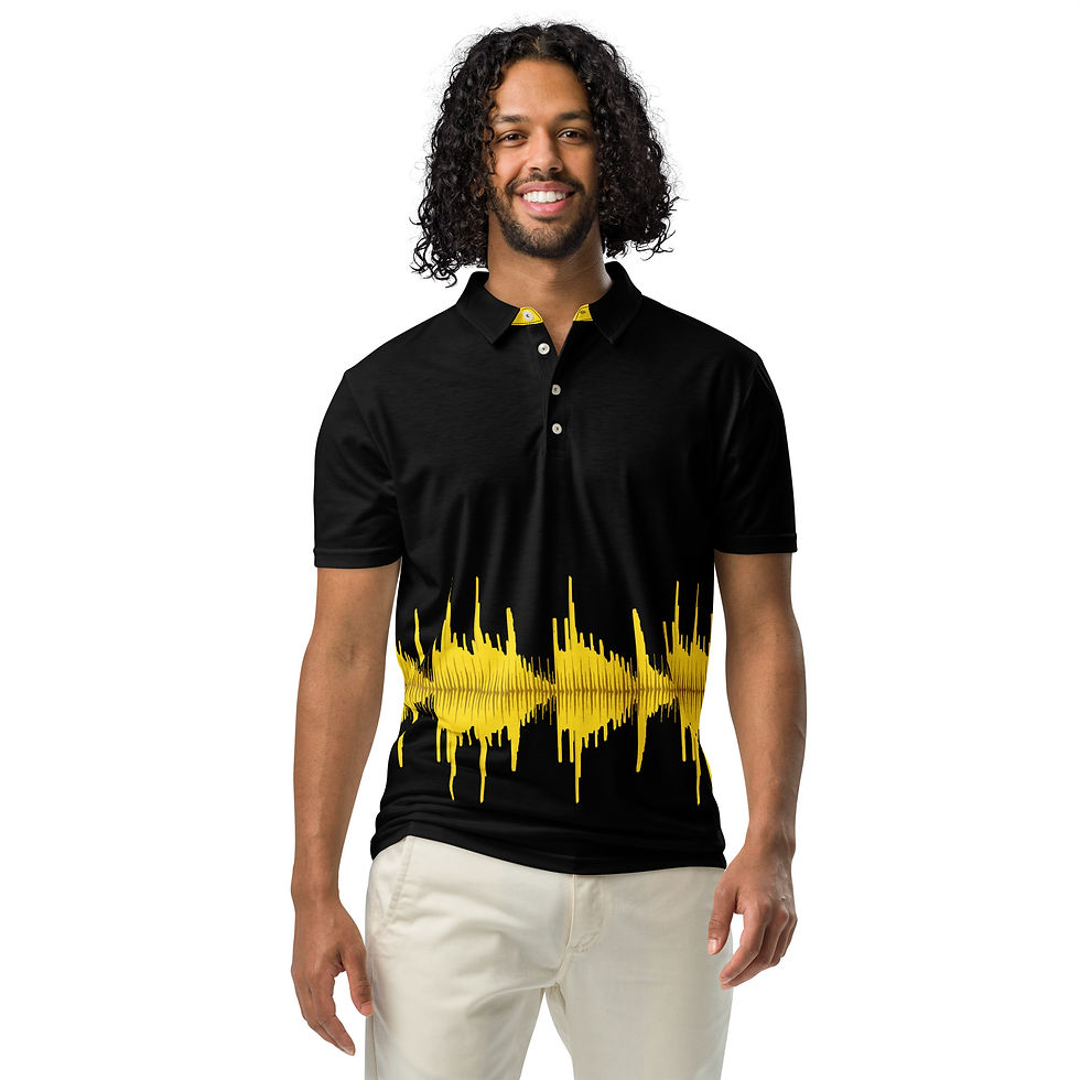


CHARLIE BEATS was a quick design, but not quick at the same time. THE NAME is essentially what the design is-- a mix of Charlie Brown and beat-making (producing): Charlie... Beats-- two things I enjoy. Yeah, I'm more of a Calvin & Hobbes individual, and even more of a Far Side than C&H, but the Peanuts gang was always cool and calm.
THE IMAGE i did it in photoshop. I do pretty much all of the designs in photoshop. Again, it was quick but not. Quick because i knew what i wanted. I wanted the feel of the "Charlie Brown shirt" but a hip hop version, in a sense. Instead of the regular zig-zagging stripe, I wanted a drumtrack waveform, and one that could even possibly be playable if there's an app or something that could read it. Not quick, because getting it to be HOW i wanted it to be was tricky. I'm thinking (not sure) that it may be a waveform image of the Clyde Stubblefield "Funky Drummer" break (solo), which is one of the most iconic drum breaks of all time, if not, it's in the top 5. I got the sample of the break from the HAMMERHEAD Rhythm Station (Drum machine) which is one i started using back in the late 90's (1998, 1999?) or early 2000's when I first got Sonic Foundry Acid (Now ACID PRO), and started doing music. So, yes, if you know how to read waveforms, you can read this shirt and hear the drumtrack play. HOW'D I DO THAT? First I played the sample of it I had from ACID and took a screen shot, but then I got an idea to separate it all, doing the kicks and snares in black, and running some high hats/cymbals (i know, two different things) also inside of it in a lighter (that gray) color. Then getting those to line up was tricky. I think I did ok. It's one of those things that IYKYK, but you should know now since I just told you. I figure producers, musicians, and maybe even drummers might dig it.
The song below the Clyde Stubblefield video, is just a song I did, chopping up some bit of the iconic Charlie Brown theme song, "Linus and Lucy". The theme song was composed and performed by American jazz pianist Vince Guaraldi in 1964, and first appeared on the album Jazz Impressions of A Boy Named Charlie Brown and became the signature theme for the Peanuts animated specials. For some reason, in my head, Charles Mingus plays it, but that might be a Mandela Effect or something. I dunno.
This section written 02.26.26
LAST EDITED: 03.12.26
shop | breakdowns menu | home | site menu
Coal Diamond


THE COAL DIAMOND design is one of those things that's not so much an image or logo, but more of a texture, style, or textile... a pattern. I wanted to try something with the "All-Over Print" style they have, as opposed to just doing designs on solid color items, inside of a square (or limited space they give you to put a design)-- basically, i wanted to test out the ALL-OVER print because i was already good at the basic "add your logo here" designing. To do that, i figure, i might as well use the entire garment (item) as a canvas, and wanted something that would look good printed all over an item-- something that looks good AS THE ITEM, and not just in one spot ON the item. Something clean and classy, simple and stylish, recognizable and proven. PLAID. It's an upscale, high-end looking pattern that goes with pretty much everything, and looks good on it's own. So i made a charcoal plaid.
THE NAME? Honestly, naming things is annoying. Creating things and getting the outcome of the creation is the goal. Then, since you have to use it, and call it back up later, you need to name it something, so you can call that name up and summon that vibration or way of BEING. It's an annoying process but somewhat inevitable. So you name things either based on the energy you want, or the energy the thing already has... like making sigils. Coal is from the original charcoal color of the diamond shape in the plaid design... and the diamond is, yeah, the diamond shape in the plaid design. So it looked like smokey grey, or charCOAL DIAMONDS. It also sounds kind of high-end, which is the feel i was going for.
THE DESIGN is simple, for the most part. It's a charcoal plaid, but the edges or trim work is a paisley in the same color-scheme. Not hard. The both of those two things leaves the majority of the design (the plaid) clean and open, meanwhile the trim adds a high-end but not overpowering accent. It looks, feels, and radiates calm, classic, and luxury, in a nonchalant and universally stylable way.
I made (in photoshop) a plaid pattern, which is basically like making a checker pattern, and then adding a grid on top, rotating it 45 degrees, and skewing it (shifting one side so the squares drop down on one side, making more of a diamond shape as opposed to a 45 degree square/block). Yeah, it sounds simple enough, when you have properly working equipment. I've tried a few things to upgrade, and life didn't agree, so i'm working with what i got here. So far, its working magic. ANYWAYS, the original pattern was in B/W (black and white, not even grayscale, just solid black and white). WHY? Because you can add color to that multiple ways. It's way easier to take a good b/w design and colorize it, than to take a color image and b/w it, or change the color. If it's a one or two color item it's easier, but if it's something multi color, it's going to e trickier (the more colors, the increase of difficulty). All of it is doable, but it's just more time consuming, so save yourself a headache, and do b/w first. HERE, i took the b/w and then filter it however you see fit. I tried to record a video on it, twice, and the computer is being a prick, so no video to show you, and I'm burned out on trying to explain it, when a video explains it better. Picture doing hard work three times and life screwing you each time. You get burnt out and stop caring and trying, and move onto something else. SO, moving on....
There are a few different methods of printing, or getting images onto items with PRINTFUL.com. The one used for this series is the "All-Over Prints", which where they take all white fabric, and print on the whole thing (end to end, completely covering it). After your design or pattern is printed on the material, it's cut and put together into whatever style of garment or product you were designing. Basically, it's like you take a sheet of white paper and print form end to end, and then fold the printed paper into whatever you want. The other (non-printed/ inside) part is still all white. This lets you get more colors and things in, but you have to make things really specific and, i'd suggest, the highest resolution you can get. For basic colors, its not bad, but if you're going for more detailed patterns and designs, then consider mixing and matching things. In that case, get used to using and working in/with LAYERS.
There are templates you can download for the All-Over-Print stuff, and make things using that, or, in their design section (designing items) there are 5 layers per part (5 layers for the front and neckline, 5 layers for the back, 5 layers for the left sleeve, 5 for the right sleeve, 5 for the tags, etc.). If you're good at designing in/with layers and using the space, AND if you have GOOD HIGH RESOLUTION IMAGES (PNG to keep the transparent backgrounds, or make things float with no border... and they take .JPG which will have a background), then you can do some pretty cool things. I've done some videos on that, which should be in that video playlist. If you still don't get that concept, picture it like this (using this section, with the text and the image gallery as an example):
1. You have a shirt which has a color (black).
2. (Layer 1 - bottom layer) On top of the black shirt, you add a layer with a .PNG image (this text). That way you can see the through the text (no background) and only the text gets printed onto the black shirt.
3. (Layer 2) Then we'll add the items in white circles gallery as a layer on top of that. These images are .JPG images (white background gets printed also, even though all you want to show is the items).
4. (Layer 3) On top of that we can add another layer with the ARROWS for the gallery. They can be (1) a .JPG of a white arrow sitting on/inside of a black box. The issue here is that since there is a black background around the white arrow, if the black box is a different black than the shirt color, then you'll see it. If it looks off, then it'll look off. Smaller image file, but bulkier in the design. OR you could use (2) just a white arrow .PNG. This means you have to crop (cut) the edges of the white circle gallery so that it's not in the same space as the arrows, so the white arrows don't get lost in the white circle gallery item pictures. The arrow will be sitting on top of the natural shirt color. Slightly larger file, but transparent background so you can add it to anything.
...Again, there are videos (in the menu video playlist) where you can see this in practice. I tried to make some specifically for this little section here, but... life... I hope you can get what you need from the videos that are here.
This section written 03.13.26
LAST EDITED: 03.13.26
shop | breakdowns menu | home | site menu
EXPLAINER VIDEOS (Merch, & Images)
EXPLAINER VIDEOS (Merch, & Images)
CRAZY TALKS #49: NO OTHER GODS BEFORE WHO? (02.05.26)
Crazy Talks #52: I HOPE THIS HELPS TOUR (hacked for social media - 02.05.26)
Crazy Talks #30'Something: "HONEST Real Talk" (01.24.26)
M E N U


ALL DESIGNS: Agnanadi; AllLies; The ArtWork's Outside The Box; BEING Symbol (Classics); BEING Symbol (Skull version); BEING BE-ing Being (Str8 Outta); BLACKLIGHT; Blacklight Quotes (Be Honest); Blacklight Quotes (No One Or Thing...); Blacklight Quotes (One Fire To Another); Blacklight Quotes (Peace & Blessings); Blacklight Quotes (The Only Thing Illegal...); Blacklight Quotes (You Still Have Time); Black Knight; Boney Phace; Charlie Beats; Coal Diamond; DefTrap Ronin; DefTrap Ronin (B.EL.YEWS); DefTrap Ronin (kNo Choice); DefTrap Ronin (The ONE); Don't Jesus The Christ Out of Yeshua, Your Self, or me (Artist & Park); THE DOORS ARE NOT EXITS; Fire Warning; Frank V. Durden; For Shore; Future's So Bright; Garuda VI; Get Crossed At Your Own Risk; Green Hero Man Guy or Girl Woman Person Thing; HappAi Face; Head In The Clouds; I Love Um...; I'm Doing My Best; Just Let AI Do It; Kemuri Ashain; Meditate On The Word Night & Day; Mind Over Matter (Game); NOT OK; OM-A-ZING; Rugpull (The Seein' Clown); Samurai Ruach (brand); Shmokey Phace; Sky's The Limit; Take A Sabbath; TryAngles; Trying To Have A Nice Day; Turn Your Frown something something...; Vesti La Giubba; Warm Jesters; WorldWide Royalty (WWR SERIES); You Fell Asleep On Purpose;
COLLECTIONS/ CATEGORIES: Agninadi (Fire dragon); Bags; BEING Symbols; Blacklight Vibe; Books, Games, & Music; Coal Diamond; Computer Love; EVERYTHING ELSE; Garuda VI; Hats & Headwear; Jackets, Jerseys, Long-Sleeves; Ladies Only; Mainly Text; Rugpull's Big Top; Samurai Ruach (Brand); Spiritual Fire; Tees (Raglan baseball tees); Tees (short-sleeve & tanks); Trying To Have A Nice Day; Vibrant Vibes; WorldWide Royalty (WWR); .