MERCH & IMAGE BREAKDOWNS

AT THE END OF EVERY SECTION is a VIDEO PLAYLIST of ALL OF THE PRODUCT BREAKDOWNS (that have videos), and also THE FULL LIST OF ALL PRODUCTS AND CATEGORIES so you can get to what you came here for easily. Each section should have a comments section if you have any comments or suggestions on that design or the products. OR YOU CAN CLICK HERE TO GO TO THE STORE.
Graphic design one of the thing I've come to do, and after having done it for a little while, I gotta say, it's pretty fun to do... when you're doing it for your self. Building your own brand is a whole other world, so if you're on that path, here's some of the behind the scenes in the whole "clothing brand" side of Samurai Ruach. Designing is great, and the most fun part for me, and maybe for you too, but I have to do all of the other parts as well, and unless you have a team or some top notch AI agents, it becomes a balance and battle of staying motivated to set goals and do all of the boring crap that "someone" has to do but there's no one but you to do them... staying inspired to keep creating and keep the fire and passion for what you love doing... even staying on top of things like technology in your field and trending themes. If you're into doing print-on-demand, there's keeping tabs on the leading products, methods, and companies, I get into a lot of these things, and you see it in real time, in the videos. Not only that, but if you were looking for the meanings to the designs-- because there's a lot packed into them, and how they were done, you're in the right place. I've done some written blog posts if you're a reader, and because of how things are as far as living situations, doing videos ended up being faster, so here's both.
LAST EDITED: 03.05.26
This section written 03.05.26
LAST EDITED: 03.15.26
shop | breakdowns menu | home | site menu


NOT OK was a quick design, but not quick at the same time. One of those things where you know what you want, but getting it is tricky. I think i have the video of making this one. WHY make it is more important than what it is. WHY make it is the reason it was made in the first place-- being not ok.
THE NAME is pretty simple, but speaks volumes. It's just what the sign says, "Not OK" or even "NO OK." Why do that? Because a lot of folks are not ok. On top of that, what is ok, looking at society...? NO. You just have to say no to it. So, this is for all of the folks who are NOT OK, whether you're ok with that or not, to help you deal with it, and give the rest of the world a heads up, also to let others know it's ok to be NOT OK right now-- you're not alone in that. Lets get to better.
NATURAL VS. NORMAL... Currently, as of 03/25/26 when I'm writing this, there's some wars (multiple) going on all around the world. Somehow this is normal. Some would say it's "in our nature" as human beings to war, fight, and even say that it's a part of survival, but warring is different than fighting, which is also different than defending and protecting. It's the intent. Doing and being what's natural is what develops, but we'd have to know our self to do and be that. Doing and being what's normal is what society says, and how it programs what was once natural. Basically, you take what's natural, and make it normal, or fit what you want normal to be. You make it into your image of normal. Humanity has been manipulated so much that even the creation of humanity, the whole purpose of it, is suspect. What is a natural human being? What's the purpose of it? Being capable of existing according to society is doable, because we're very resilient and adaptable, but how we war with society, control, being programmed and used, shows how what's natural doesn't agree. Because of that, a lot of people are NOT OK. What has become of our mind, body, spirit... also our time, mind, and resources... what's normal is not natural, and the real, honest, US is not ok with that. A trick here is that society, to keep control, manipulates you when you say it-- so, the shirt says it for you.
THE IMAGE i did it in photoshop 6 like all of the others. I can't remember how the computer was behaving that day. It's a simple design. Make a red circle and copy it. Take the copy and shrink it to the size of the hole you want. Delete that shape from the original (larger) circle. Make a rectangle of the same shade of red, and use that as the crossing (signature "no") arm/bar. If you're doing a vertical arm (a red bar straight up and down) you just rotate it 45 degrees or whatever feels right. THE TRICKY PART is finding the "OK" font. In the video you might see me going through a few. I wanted something bold, so it could easily be read on different color shirts, so that was easy. Also, something clean and straight, no handwriting or stylized fonts, again, so that it's easily readable. Something as easy to read as a stop sign. The only tricky part was "Squared letters?" or "Rounded Letters?" With rounded letters it looks very friendly, very warm, which is great, but sometimes when you're NOT OK, that's the wrong vibe. Of course, for the squared off letters, it's more bold, more cut and defined, more individual, but when you're NOT OK, you might want to be around other people, and not be so cut off and machined. Then it comes back to the thickness (boldness) of the letters. If it's squared and thin then it looks off. Thicker and squared looks more friendly. Meanwhile, rounded and thin looks like a noodle, and really bold and rounded looks cartoony, or doughy. I think that might be where the squared off lettering won.
WRITTEN/Created: 03.25.25
LAST EDITED: 03.29.26
This section written 03.05.26
LAST EDITED: 03.15.26
shop | breakdowns menu | home | site menu

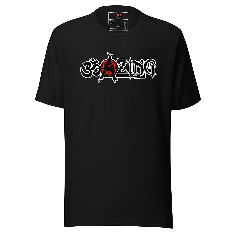


OM-A-ZING isn't it?! Why yes, yes it is. Another amazing thing is how i had written this thing out already and the computer decided to stop working and delete it, even with the auto-save on. SO, this must be one of those REALLY good designs. The more trouble i have doing a thing, the more good its going to do i figure, or else life wouldn't be trying to stop it.
THE NAME is a combination of the parts that make it up. OM, the A (anarchy symbol), and some ZING at the end, as if the balance of OM and ANARCHY isn't spicy enough. It's for the folks who have, or are, any of those ingredients that makes them OMAZING.
OM (from a little digging) comes from Sanskrit, was first used in 1788 ad, and pretty much is a sacred spiritual symbol, sound, and mantra originating in ancient India, widely used in Hinduism, Buddhism, and Jainism. It is considered the primordial sound of the universe, representing the Divine, creation, and the union of mind, body, and spirit. Often chanted in meditation, it signifies tranquility and divine presence. SO basically, the sound and vibration of pure BEING.
The ANARCHY (A) is a double design. There's the recognizable "A", which i forget what fonts I used to build that, but i made that from scratch. It's not hard to do. Making fonts is a fun thing when you get into it, so it ended up being a little more involved than it had to be. I think it was a mix of maybe 3 or 4 fonts, and some other drawings and modifications i did. What is ANARCHY anyways? Anarchy is the absence of a centralized government, authority, or enforced hierarchy, derived from the Greek anarchos meaning "without rulers". It is often misused to describe chaos, but philosophically, it represents a society based on voluntary cooperation, self-government, and freedom. Most people think CHAOS and rebellion, but it's not that at all. Another definition, straight from the dictionary is:
1 a: a state of lawlessness or political disorder due to the absence of governmental authority
b: absence of government
c: a utopian society of individuals who enjoy complete freedom without government.
2 a: absence or denial of any authority or established order
b: absence of order : disorder
3 : the theory, advocacy, or practice of anarchism
The ZING is a custom thing too. I put together a few different fonts to make that, with some further work after I got the blends pretty much how i wanted them. Blending fonts, again, is fun, and sometimes you want to do things a few different ways, so what you see is the design that i finally had to stop myself. There's all different styles of lettering i could have done, and each one says something different-- they all have their own vibe. Some are more gothic and cold, others more warm or fun. The one I have here looks more like "time" to me. It's got a balance of dark straight hard edges, and some curves to it, and some dark edge to it. Plenty of other things i could have done, but this was balanced enough in the way i wanted, and it seemed to match the OM and the ANARCHCY together.
All together you get something OM-A-ZING. That pure vibration and root of all things, which is existing freely outside of being governed our dependent on outside systems and control-- free to purely bee it's pure self. To add to that, some fire, spark, some ZING to it. It's a balance between all things. There's a video on all of this-- both the breakdown of the meaning, and I think of the actual creation of the design, which also gave me some issues doing. Yeah, this must be one of those ones.
Honestly, we're all ALL of those ingredients, and more, but society, trying to be polite, and a few other things mute and suffocate those three keys to freedom. They're natural, but not what society deems as normal, so there's a conflict. Because of society and how things end up being due to economics, more and more people are concerned with NOT BEING WRONG than they are with BEING RIGHT. In being right, you get rewarded. However, when you're wrong you get penalized, and more people are struggling to stay afloat, working their way up to zero, so being punished for being wrong is even worse that how good it feels to get rewarded for being right. Fear is stronger than love i guess.
THE IMAGE i did in photoshop. I do pretty much all of the designs in photoshop 6. It's what i have that's working that i'm efficient with, and for the most part, the computer will actually run somewhat consistently. How's about some music?!


WRITTEN/Created: 03.29.25
LAST EDITED: 03.29.26


It would be nice if the laptop would run the drawing tablet again, but until then I'll just have to do things in the photoshop i have... which is ...old.


SOFTWARE? Photoshop. I did that design in photoshop. I have Photoshop 6.0. Yeah, I know. Well, what are you doing with YOUR version of Photoshop? I'm using what I have... that will actually work. As mentioned above, I have a drawing tablet that works well, but THE HORSE is THE HORSE, and when it doesn't want to run things (which is usually when I need them most) then it WON'T. So, I have drawing tablet, but... not.


THE DESIGN? Old grizzled man but faded into a skull, like aged away, but the eyes and the fire in the eyes remains. It's like a "you can't kill wisdom, or ideas" thing. I started with a pic I AI'd of the Old Grizzled Man, and then the Skull picture. I had to make sure the eye sockets lined up. Then it was just stacking copies of the layers on top of each other, and erasing, like fading them away. The old man Is on the bottom I think, with multiple layers of skull on top, but those skull layers are erased, masked, and filtered so that they all fade more and more. The old man can be seen more on the left side, and is blue (MATTER), while the skull is mostly on the right side and is red (MIND). No, it's not directly related to the game. It should be, but... no, I wasn't thinking of that. Doing the eyes was the most fun part, and tedious. It pays to use AI to make your own stock photos that you can use. I did that with the fire, and I had some of eyes, so I basically cut the fella's eyes out, like a Batman mask, and then blacked all around the inside in a lower layer. So it's Skill on top, then man-face, then highlights on the eyes, then fire, then eyes, then masked fire underneath for extra glow but kind of muted to look more natural (under the skin of the eyes-- yes your eyes have skin. I had a metal splinter, and a splinter of fiberglass in my eyes before-- trust me, you eyes have skin), and then black to fill in the eye socket, and then more man face beneath that to seal it.
A quick bit about Artist and Art vs Content Prompters and AI... Yes, Content Prompters. You're not even content creators anymore, because you don't create anything. AI does it. You just make a prompt. And you can even get AI to do that. It's sad. And disturbing. Seems like a bit of work, but when this is one of the things you DO-- like know how to do, love doing (for your self, not so much for others), and are actually good at, then you don't mind experimenting and actually putting in work. It's a process, a journey-- it's fun. SADLY, there's folks who just want to make content for sales. There's no logic, no skill, no talent, no real effort, just a prompt, and if they had any know-how, it's which AI bots to use for marketing so the folks who actually DO THIS, but don't know all of those tricks (because we're too busy working) get lost in the huge pile of CONTENT STREAM CRAP. That's a sad thing about artists and art-- especially in this day and age. It gets lost. The soul people are looking for is out there being expressed, but it's drowned out by all the AI screaming for attention, because you're looking for the soul you drowned out with your content for likes and money-- because you've lost your soul ... to the computer world.
VARIATIONS... There are currently 3 different variations of this shirt. There's the 1 - WOMEN'S (All Over Print) and a 2 - MEN'S (All Over Print), both of which are in a set called the Splash Series, because of the splash of color strip on the bottom. The last one is 3 - The Unisex (Mens & Womens) Bella canvas tee. They're all pretty soft and comfortable, but the Bella Canvas one is more plain, with just the front image. It's printed a different way also. The ALL OVER prints are actually white shirts and the entire shirt is printed, so it's almost dyed black (printed black), while the Bella Canvas shirt is a black shirt with the image printed on it. I'm using PRINTFUL at the moment to do the print-on-demand, which is why the price is what it is.
 |  |  |
|---|---|---|
 |  |  |
 |  |  |
 |  |  |
 |  |  |
Anyways, BACK TO THE DESIGN... The skull part was annoying. It was tricky to balance because the man's face was so grizzled, but that's what I wanted. Look at that guy. He's been through some stuff. Doing the guy in Blue, as in MATTER, was a bit of poetry, mostly on the side of the Skull being in Red, representing MIND. Why is the Skull the dominant Mind? Because our bodies pass away. The fire in the eyes is what moves on. So in a sense, the skull is more of a solid reminder of who and what we are, beneath the skin and age and scars. The fire in the eyes is the cleanest and most solid thing, so that cuts through everything. Since it's faded and masked on top of the blue, it comes out purplish, which is cool, because it's got a bunch of Blacklight Philosophy on it, so, that works. Speaking of which.....
THE WORDS?
"ONE FIRE TO ANOTHER
1. Consider until you Understand until you Know until you Are BEING.
2. No one or thing that is conscious to the point of being, thinking, and expressing, does anything unless they get something from it... and the thing most sought after is the experience that yields a knowing of divinity of self in the now.
3. Be Honest. All Ways, Always.
4. You are BEING: (1) WITH a Spirit, (2) HAVING a Spirit, or (3) IN a Spirit.
5. Everything is something to do.
6. You can't help but judge. Try not to condemn or glorify. Everything is what it is. Nothing More, Nothing Less. There is Divinity in all things and moments, despite your perception and opinion of it.
7. Know The Word. The Word is GOD.
8.Walk YOUR Walk. It will take your entire eternal conscious being to know your self.
9. You are BEING here for a reason. All WHYS, WISE, and Y'S are universally the same. Know YOUR WHYS. You know all, as all is in you. Here in this "Reality" of deception, illusion, distraction, division, etc... you are made to be thinking of what you know... but you still know.
C'est la vie, la guerre, et le jeu."
One Fire To Another is a phrase that you may see here and there in the Samurai Ruach philosophy writings. The rest of the words are have a clean Blacklight edge on them. "They block a lot of the face!" Yeah, they were supposed to. The idea is the ideas. The face behind the ideas is the face behind the ideas-- get it? I've done a few Blacklight Philosophy or Blacklight themed shirts. There's a BEING SYMBOL shirt which has a blacklight edge to it, the Skull Version is heavily blacklight in style. What's "Blacklight?" You must not have hit that link. Here's another one to get you caught up, but basically the philosophy is a style of being who is balanced in a way most things might not agree with or understand. It's a true "Honor Thy Father (Mind/ Fire/ God/ Red/ Divine Masc.) and Thy Mother (Matter/ Water/ Spirit/ Blue/ Divine Fem.) so that your days (knowing, illuminations of being-- which creates time) will be long..." The balance of the two sides expressed as an unlocked Pure Being is Blacklight fire (red & blue balanced fire) which is one of the hottest, and also least visible. It's a way of being, and an honesty and knowing of self that most will actually fear, and misjudge it a lot. It's rooted in "seeing the light in darkness, and the darkness in light." So, not being fooled by anything, and seeing everything. As it was once said in the movie i like a great deal, GHOSTDOG: The Way Of The Samurai, "Power, Equality... Always C Everything."
The videos are there because I'm lazy and tired. I made a template and fill in the pages, so the videos were just down there. You might find something interesting in there so I left it. AND I was thinking about how I have to do this page AGAIN to format it for phones, which just drained me, so... lazy also, and tired.
02.26.26 (as of today the tablet is kind of working again with the program... when it wants to.)
Apocryphon of John
Apocryphon of John

The Book Of Enoch - Definitive Reference w/ audio and text, full apocryphal religious narration
The Secret Book Of John - Gnostic Text From The Nag Hammadi Library - Full Audio Book

Genesis 6:1-4 Is Not About Human Marriages — Part 1 | Michael Heiser
WRITTEN/Created: 10.16.25
LAST EDITED: 03.29.26


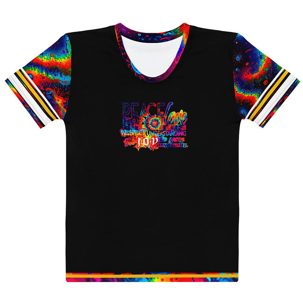


PEACE POWER BLESSINGS & RESPECT... is one version of email and online greetings or closings that I would give. Words have power. Picture walking around IN positive words?! That would resonate quite a bit. You'd have a constant reminder, and spread the great vibes even easier, faster, without even trying. That's the intent. How'd i do? I guess that depends on whoever gets and wears it, spreading those great vibes.
THE PHRASE is PEACE POWER LOVE BLESSINGS RESPECT UNDERSTANDING AND JOY TO YOU MY FAMILY. All of that should be pretty understood. The "MY FAMILY" part is because we're all family. Humanity, all of the animals, plants, minerals, germs... everything here in creation is a part of the family of creation-- one individual unique expression of the divine being be-ing the divine you. Like it or not, we're all connected and family.
THE DESIGN is another version of one of the WWR designs. I'd actually written all of this before today (03.29.26) but the computer and life decided to delete it all and now I'm doing it again... which means I'll have to re-link all of the pictures again to the store. MEH. C'est le jeu. BUT, yes, it was one of the old WWR designs. There was Arabic writing after it, and since people can be idiots, and some of those idiots can red a message bestowing peace and positivity on them, breaking curses and helping to liberate them, they'll see Arabic and then be a jerk because they don't understand it, completely ruining the whole vibe, cheating their self out of the blessing. C'est la vie, la guerre, et le jeu. Everything is something to do-- even being an idiot. SO, for the sake of people who will get the shirt/design, i took that part off so they won't have to deal with idiots.
It's just a bunch of fonts and colors. One good thing about having options is you have a lot to pick from. One bad thing about having options is you have a lot to pick from. There are some people who know "their color" and the choice is easy, but then others who get stuck, and actually tap out (burn out) trying to make a decision, overwhelmed at all of the freedom and positivity. All i can do is try to put as much positivity as i can into the design, and make it look good. I'll let you pick which one, or two, or all of them are for you.
WRITTEN/Created: 03.29.26
LAST EDITED: 03.29.26


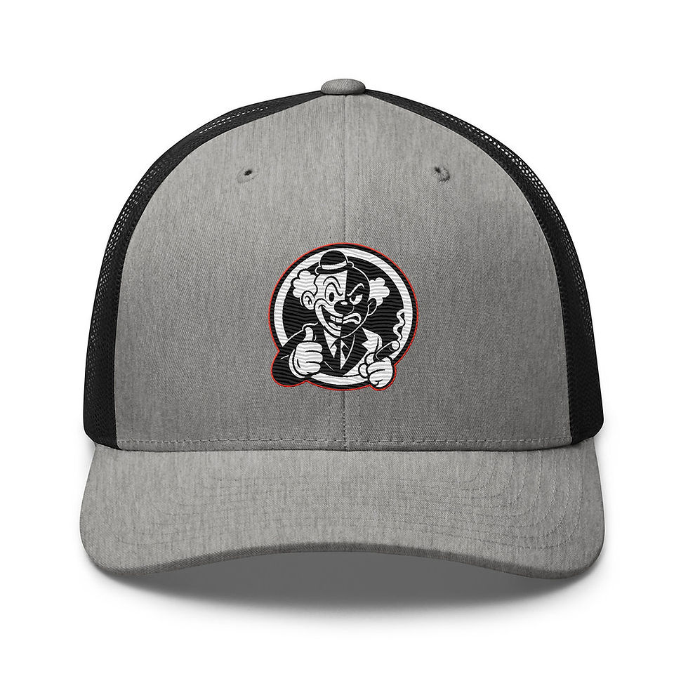


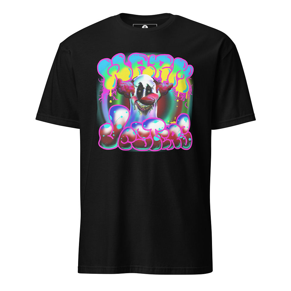
RUGPULL (The Seein' Clown) is deeper than it looks. It might look like just a cute face clown, or a classic cartoon style, but so much of it was done very carefully. There are actually two versions, this one being the first version, but also the more dialed back one. The second version is the one that appears on the TRY ANGLES design with the cigar. That one is just as detailed, but because of the eye colors and more of an edgier, even "darker" to some people, look, i saved that one for the real people. The ones who get into this side of Samurai Ruach for a trend can have fun with this version, but the folks who are more serious understand the other one more.
THE MESSAGE is a bit to unpack, as they say. In a way it's best unveiled or broken down, in the design, piece by piece, so I'll get into it deeper there, but overall, the message would be that this is all a show. This "reality" is a stage in stages, and all of the conscious beings are clowns-- beings who's makeup and costume is divinity masked and painted and suited up to dance, juggle, make balloons, and all of the other stuff in the Book Of The Klown (another kind of unfinished hidden writing in the Samurai Ruach text).

THE DESIGN was done in Photoshop 6 like all of the others. I didn't record it because i wasn't thinking to, for one, and also because I was having so many issues with it, and memory-- it not wanting to save, and me going through that whole process of deleting things, clearing cache, etc.... that i was just happy to get it done. Get what done? OH, right... SO... (and this is in the video) what i had to do was, make a half black/half white paisley card to use as the background, and then an opposite one white/black for the reverse side, so that the image front and back would have one solid left side color, and one solid right side color. That's how one side of the shirt is black and the other side is white/silver. I used the same cards for the sleeves. Having both colors on one card saves layers-- as opposed to having one black layer and a white layer, they're both on the same layer as one solid image. THEN i redesigned the "3 SPIRITUAL RELATIONSHIPS" chart image, and fused it with the "Creation of BEING(?)" image, so, again, there's two images made into one image to save layers. I took one of the masks from THE BOOK OF THE CLOWN (cover) from that book that i think is on Patreon, but nowhere else. It might still need to be worked on. Living took a turn when i was working on updating it, so, what's there is there.
I know there are a few videos in the playlist for this design. As of today (2.26.26) i probably still have videos of this design that need to get edited. Yay life. I still got time.
Send In The Clowns
Send In The Clowns

The Master Clowns (Clown History)

Warm Jesters Drawing

2025 12 19 12 12 44 Feel Spirit Touch Logic
WRITTEN/Created: 03.29.26
LAST EDITED: 03.29.26


VESTI LA GIUBBA (e la faccia infarina. La gente paga, e rider vuole qua.)... Honey of a quote, ain't it?! There's a video and a whole playlist just for this, which is below. This phrase is kind of where the RUGPULL design came from, why THE ZEPHANIAH CHESTERFIELD PROJECT, and why a lot of other things... for me. ay it for me, and when it lifts someone else up, and they thank me for it, then that will be the kickstart i needed to get back into the positive zone. T-shirts do that. It's one of the reasons I do t-shirts-- to say the things people can't, but want to, or need (to).
THE MESSAGE is a quote from PAGLIACCI the opera, which says:
"(Vesti la giubba)......... Put on your costume
(e la faccia infarina)... and apply make up to your face.
(La gente paga,)......... The people pay,
(e rider vuole qua.)..... and they want to laugh.".
What all of that means to me, if you didn't see the explainer video about the lineup, is how you have to put on your face (makeup your mind) and also build your self physically and tangibly (body & soul) to play this game. By "play this game" i mean come to this world as a human being (makeup and costume), where people pay (trade currency & current-see) by way of soul and spirit energy transactions, thinking of thoughts (currency) to manipulate reality (current-see), because they WANT to laugh, or have a good time, make memories, and gain on their investment in conscious being, because we're all staring down the barrel of eternity which is a loooooong time to not have anything fun or good or light to look back on. SO, get yourself right, and be your honest self, live and be that, so you can enjoy the show (this war-- in and of the mind). C'est la vie (that's life and living it), la guerre (the war/ the mind), et le jeu (and the play/ the game).
THE DESIGN was done in Photoshop 6 like all of the others. I didn't record it because i wasn't thinking to, for one, and also because I was having so many issues with it, and memory-- it not wanting to save, and me going through that whole process of deleting things, clearing cache, etc.... that i was just happy to get it done. Get what done? OH, right... SO... (and this is in the video) what i had to do was, make a half black/half white paisley card to use as the background, and then an opposite one white/black for the reverse side, so that the image front and back would have one solid left side color, and one solid right side color. That's how one side of the shirt is black and the other side is white/silver. I used the same cards for the sleeves. Having both colors on one card saves layers-- as opposed to having one black layer and a white layer, they're both on the same layer as one solid image. THEN i redesigned the "3 SPIRITUAL RELATIONSHIPS" chart image, and fused it with the "Creation of BEING(?)" image, so, again, there's two images made into one image to save layers. I took one of the masks from THE BOOK OF THE CLOWN (cover) from that book that i think is on Patreon, but nowhere else. It might still need to be worked on. Living took a turn when i was working on updating it, so, what's there is there.
I know there are a few videos in the playlist for this design. As of today (2.26.26) i probably still have videos of this design that need to get edited. Yay life. I still got time.
WRITTEN/Created: 03.29.26
LAST EDITED: 03.05.26
NOTE: The items above go from TRYANGLES (Clown) to TRY ANGLES (Mask).


SHMOKEY PHACE was just a fun test that came out pretty good. There are different printing techniques, and things like halftones (shadows) and transparencies are tricky with some but easy with others. SO, to figure it out, you have to try it and see what works. So, this design was partly that, and also partly something i wanted to see on a shirt, which was a design made of smoke.
THE NAME? It just seemed fitting, since it's like a medieval jersey (pattern). Ironically, there's no Black Knight character in the series... yet. I know, DRAGONS, but no black knight. Meh.
THE DESIGN was honestly all about chainmail. Not chain letters. Chainmail, like suits of armor. I still have a project to do concerning this, which is building a jersey that's a samurai suit of armor. I just have to design the pieces separately, but this was a bit of a test run to see how the chain would come out, and i like it. I added the paisley to give it a little more edge, and then some plaid as a finer detail. It all worked really well... says me. The tricky part, or A tricky part, is keeping the aesthetic of it. Adding color would throw off the whole vibe. Some you can get away with, but the metal look has to be just right: the right amount of shading, highlight, "shine"... so that the gold looks gold and not yellow, or that any detail in a black mesh would even show up. I still have to work with this one more. There's only a few designs that I used it with. I guess it's a limited edition kind of thing.
This section written 02.28.26- last edited 02.28.26
LAST EDITED: 03.05.26


SKY'S THE LIMIT is the short name for this one. I'll save things under a shorter name to make it easier to find. The actual whole phrase is "If The Sky's The Limit, Disguise The Limit." If you got it, you're cool. If not, you're still ok. Here's a few ways to explain what it means: If the earth is your prison (hell), then make heaven out of it. That's one for the folks who want better. Wanting better means how it is now isn't good enough... or else you wouldn't want better.
THE DESIGN was done in Photoshop 6. Yeah, for an old outdated thing, it's suuuure been putting in work-- cranking out some bangers! It's only partly the tools you have. If you have sub-par tools, it helps to have a great deal of patience, vision, and understanding of how to bend the rules and get life to do the living you want. None of it is needed-- everything in conscious being is wanted, says me. ANYWAYS, so, yeah, photoshop 6.
The WWR (WorldWide Royalty) stuff had a lot of designs in frames. The idea was [whatever the idea was] which required the frames. This was halfway a design for there, but i actually view this as kind of darker in tone, so, while it would fit in with the rest of them, i set this one aside.
I know there are a few videos in the playlist for this design. As of today (2.26.26) i probably still have videos of this design that need to get edited. Yay life. I still got time.
LAST EDITED: 03.05.26
M E N U
EXPLAINER VIDEOS (Merch, & Images)
EXPLAINER VIDEOS (Merch, & Images)

CRAZY TALKS #49: NO OTHER GODS BEFORE WHO? (02.05.26)

Crazy Talks #52: I HOPE THIS HELPS TOUR (hacked for social media - 02.05.26)

Crazy Talks #30'Something: "HONEST Real Talk" (01.24.26)


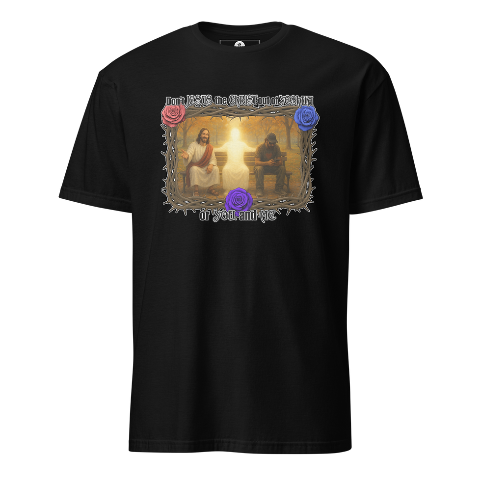


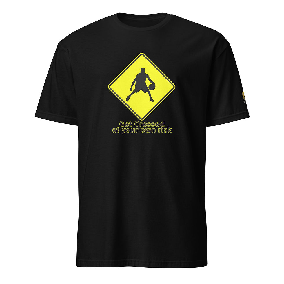


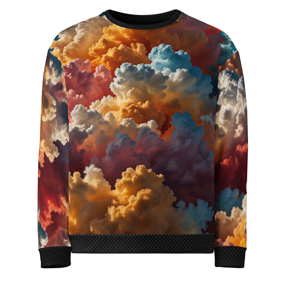


ALL DESIGNS: Agnanadi; AllLies; The ArtWork's Outside The Box; BEING Symbol (Classics); BEING Symbol (Skull version); BEING BE-ing Being (Str8 Outta); BLACKLIGHT; Blacklight Quotes (Be Honest); Blacklight Quotes (No One Or Thing...); Blacklight Quotes (One Fire To Another); Blacklight Quotes (Peace & Blessings); Blacklight Quotes (The Only Thing Illegal...); Blacklight Quotes (You Still Have Time); Black Knight; Boney Phace; Charlie Beats; Coal Diamond; DefTrap Ronin; DefTrap Ronin (B.EL.YEWS); DefTrap Ronin (kNo Choice); DefTrap Ronin (The ONE); Don't Jesus The Christ Out of Yeshua, Your Self, or me (Artist & Park); THE DOORS ARE NOT EXITS; Fire Warning; Frank V. Durden; For Shore; Future's So Bright; Garuda VI; Get Crossed At Your Own Risk; Green Hero Man Guy or Girl Woman Person Thing; HappAi Face; Head In The Clouds; I Love Um...; I'm Doing My Best; Just Let AI Do It; Kemuri Ashain; Meditate On The Word Night & Day; Mind Over Matter (Game); NOT OK; OM-A-ZING; Rugpull (The Seein' Clown); Samurai Ruach (brand); Shmokey Phace; Sky's The Limit; Take A Sabbath; TryAngles; Trying To Have A Nice Day; Turn Your Frown something something...; Vesti La Giubba; Warm Jesters; WorldWide Royalty (WWR SERIES); You Fell Asleep On Purpose;
COLLECTIONS/ CATEGORIES: Agninadi (Fire dragon); Bags; BEING Symbols; Blacklight Vibe; Books, Games, & Music; Coal Diamond; Computer Love; EVERYTHING ELSE; Garuda VI; Hats & Headwear; Jackets, Jerseys, Long-Sleeves; Ladies Only; Mainly Text; Rugpull's Big Top; Samurai Ruach (Brand); Spiritual Fire; Tees (Raglan baseball tees); Tees (short-sleeve & tanks); Trying To Have A Nice Day; Vibrant Vibes; WorldWide Royalty (WWR); .